> ## Documentation Index
> Fetch the complete documentation index at: https://docs.ringg.ai/llms.txt
> Use this file to discover all available pages before exploring further.
> ## Agent Instructions
> To search or read these docs, connect the Ringg docs MCP server at https://docs.ringg.ai/mcp (no key needed; tools search_ringg_ai and query_docs_filesystem_ringg_ai) instead of browsing pages one by one. Setup for each client: https://docs.ringg.ai/resources/mcp-server/docs-mcp-server/mcp-for-ai-assistants.md
> The dashboard labels agents "Assistants"; these docs say "agent". Both mean the same object, identified by agent_id.
> API base URL: https://prod-api.ringg.ai/ca/api/v0. Send the workspace API key in the X-API-KEY header, from server-side code only.
> Placing a call dials a real phone number and spends credits. Confirm the number with the user before calling.
> To act on a Ringg workspace (place calls, edit agents, read transcripts), use the separate Ringg workspace MCP server at https://mcp.ringg.ai/mcp: https://docs.ringg.ai/resources/mcp-server/workspace-mcp-server/overview.md
# Chat component recipes
> Copy worked recipes for Ringg AI chat components: lead capture into a CRM, live plan pricing, slot booking, brochure downloads, quick replies and page actions.
Each recipe gives the blocks and the wiring for one common job. The block outlines are shorthand, not a file format. Bindings and request settings are explained in [Data](/documentation/deploy/web-and-apps/web-widget/data).
## Before you start
Paste each idea into its **Chat** panel, then fix details in **Blocks**.
Components render only from a `2.0.0-beta` build.
## Capture a lead and push it to your CRM
The agent qualifies the visitor in conversation, then shows a short form instead of asking for each field in turn.
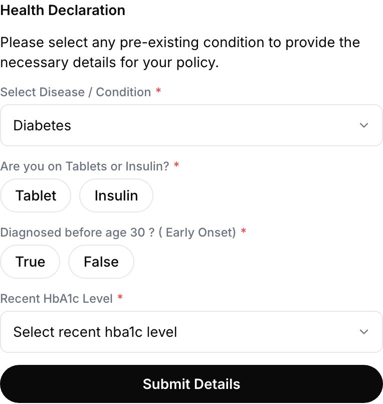 Blocks:
```text theme={null}
card
header "Share your details"
form
input_text name=full_name label="Full name" required
input_phone_number name=phone label="Phone number" required
input_email name=email label="Email"
button "Submit" when tapped: Send to agent action_id=submit_lead
```
Wiring: The **Send to agent** button sits inside the `form`, so it sends that form's inputs. Point **Call an API on response** at your CRM:
```json theme={null}
{
"name": "${{component_data.values.full_name}}",
"phone": "${{component_data.values.phone}}",
"email": "${{component_data.values.email}}",
"source": "ringg-chat"
}
```
Ask only for fields you need now; the agent can collect the rest in conversation.
## Compare plans on live pricing
Prices, stock and eligibility change, so render them from your API rather than typing them into the component.
Blocks:
```text theme={null}
card
header "Share your details"
form
input_text name=full_name label="Full name" required
input_phone_number name=phone label="Phone number" required
input_email name=email label="Email"
button "Submit" when tapped: Send to agent action_id=submit_lead
```
Wiring: The **Send to agent** button sits inside the `form`, so it sends that form's inputs. Point **Call an API on response** at your CRM:
```json theme={null}
{
"name": "${{component_data.values.full_name}}",
"phone": "${{component_data.values.phone}}",
"email": "${{component_data.values.email}}",
"source": "ringg-chat"
}
```
Ask only for fields you need now; the agent can collect the rest in conversation.
## Compare plans on live pricing
Prices, stock and eligibility change, so render them from your API rather than typing them into the component.
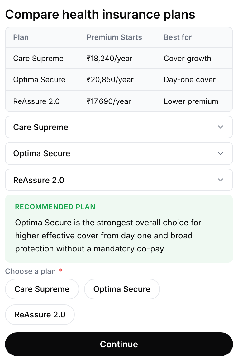 Blocks:
```text theme={null}
carousel
card repeat over ${{api_res.plans}} as plan
badge ${{plan.tag}}
header ${{plan.name}}
facts Cover ${{plan.cover}}
Premium ₹${{plan.premium}}/mo
button "Select this plan" Send to agent value ${{plan.id}}
```
Wiring: Turn on **Fetch data before showing** with a `GET` to your pricing endpoint. The response binds to `api_res`, and the `repeat` renders one card per plan.
Because the card repeats, keep one Action ID for the whole list and give the button a **Value** of `${{plan.id}}`. Read `${{component_data.value}}` to know which plan was chosen.
## Book a slot
Start from the **Calendar slots** template. It shows a pill choice for the day and a time button per free slot. The slots don't come from your API: the component's **Availability** settings generate them each time it is sent.
| Setting | Range | Template default |
| - | - | - |
| **Days** to offer | 1 to 7 | 3 |
| **Every** (slot interval) | 30, 60 or 90 minutes | 30 |
| **Max** slots per day | 1 to 48 | 18 |
| **From** / **To** (daily window) | 24-hour times | 09:00 / 18:00 |
| **Timezone** | IANA zone | `Asia/Kolkata` |
Wiring: Each time button's **Value** carries the slot's date and time, so **Call an API on response** can create the booking with `${{component_data.value}}`.
## Offer a brochure download
A link button opens the file without ending the conversation.
Blocks:
```text theme={null}
carousel
card repeat over ${{api_res.plans}} as plan
badge ${{plan.tag}}
header ${{plan.name}}
facts Cover ${{plan.cover}}
Premium ₹${{plan.premium}}/mo
button "Select this plan" Send to agent value ${{plan.id}}
```
Wiring: Turn on **Fetch data before showing** with a `GET` to your pricing endpoint. The response binds to `api_res`, and the `repeat` renders one card per plan.
Because the card repeats, keep one Action ID for the whole list and give the button a **Value** of `${{plan.id}}`. Read `${{component_data.value}}` to know which plan was chosen.
## Book a slot
Start from the **Calendar slots** template. It shows a pill choice for the day and a time button per free slot. The slots don't come from your API: the component's **Availability** settings generate them each time it is sent.
| Setting | Range | Template default |
| - | - | - |
| **Days** to offer | 1 to 7 | 3 |
| **Every** (slot interval) | 30, 60 or 90 minutes | 30 |
| **Max** slots per day | 1 to 48 | 18 |
| **From** / **To** (daily window) | 24-hour times | 09:00 / 18:00 |
| **Timezone** | IANA zone | `Asia/Kolkata` |
Wiring: Each time button's **Value** carries the slot's date and time, so **Call an API on response** can create the booking with `${{component_data.value}}`.
## Offer a brochure download
A link button opens the file without ending the conversation.
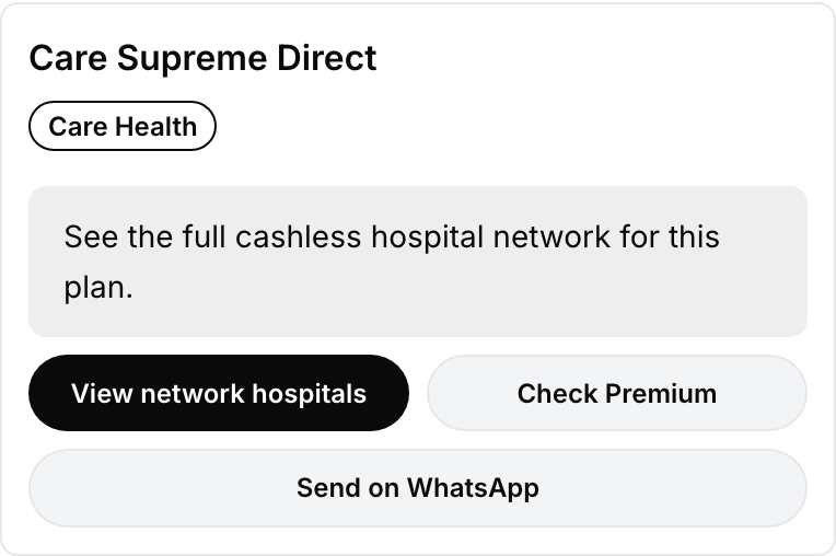 Blocks:
```text theme={null}
row
button "Download brochure" Open a link https://cdn.example.com/brochure.pdf target=_blank width 50
button "Talk to an advisor" Send to agent action_id=request_callback width 50
```
Wiring: Set both widths to `50` inside a horizontal **Stack** ([Sizing](/documentation/deploy/web-and-apps/web-widget/components#sizing)). If the brochure differs per plan, return the full URL from your fetch and bind `${{api_res.brochure_url}}`.
## Confirm an order and show its status
A read-only summary the visitor can scan, with the next action attached to it.
Blocks:
```text theme={null}
row
button "Download brochure" Open a link https://cdn.example.com/brochure.pdf target=_blank width 50
button "Talk to an advisor" Send to agent action_id=request_callback width 50
```
Wiring: Set both widths to `50` inside a horizontal **Stack** ([Sizing](/documentation/deploy/web-and-apps/web-widget/components#sizing)). If the brochure differs per plan, return the full URL from your fetch and bind `${{api_res.brochure_url}}`.
## Confirm an order and show its status
A read-only summary the visitor can scan, with the next action attached to it.
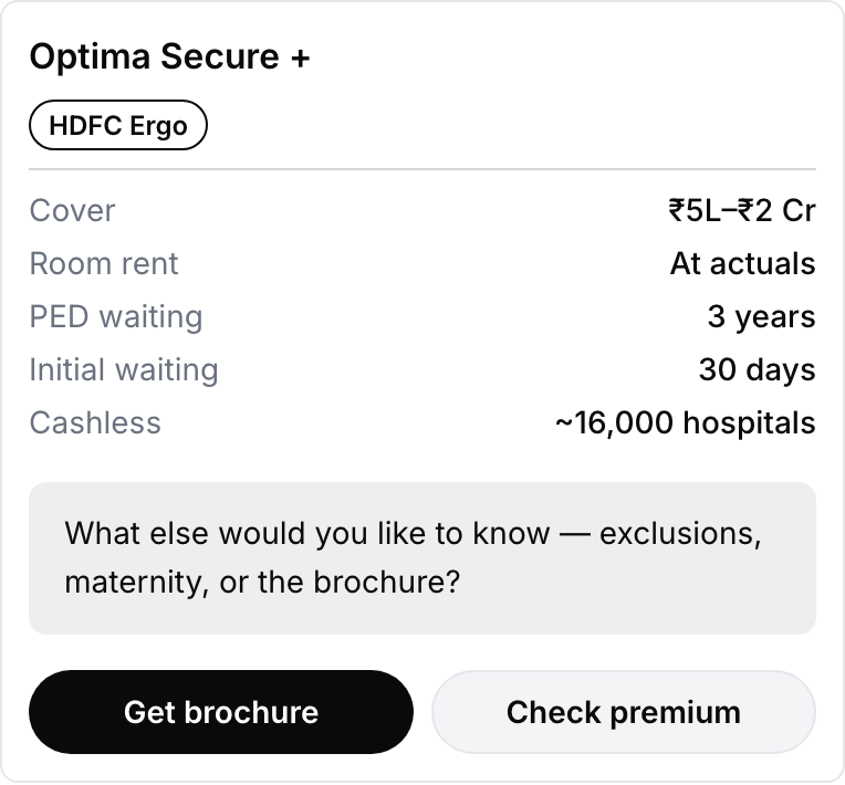 Blocks:
```text theme={null}
card
header "Order ${{api_res.order_id}}"
badge ${{api_res.status}} tone=success
facts Placed ${{api_res.placed_on}}
Items ${{api_res.item_count}}
Total ₹${{api_res.total}}
image ${{api_res.thumbnail}} width 40
button "Track shipment" Open a link ${{api_res.tracking_url}}
```
Wiring: One `GET` in **Fetch data before showing**, keyed on a parameter the agent fills:
| Parameter | Kind | Description given to the agent |
| - | - | - |
| `order_id` | dynamic | The order number the customer is asking about. |
Add it to the fetch as a query param row: `order_id` = `${{order_id}}`.
## Disambiguate with quick replies
When the agent isn't sure what the visitor wants, offer the likely answers as buttons.
Blocks:
```text theme={null}
card
header "Order ${{api_res.order_id}}"
badge ${{api_res.status}} tone=success
facts Placed ${{api_res.placed_on}}
Items ${{api_res.item_count}}
Total ₹${{api_res.total}}
image ${{api_res.thumbnail}} width 40
button "Track shipment" Open a link ${{api_res.tracking_url}}
```
Wiring: One `GET` in **Fetch data before showing**, keyed on a parameter the agent fills:
| Parameter | Kind | Description given to the agent |
| - | - | - |
| `order_id` | dynamic | The order number the customer is asking about. |
Add it to the fetch as a query param row: `order_id` = `${{order_id}}`.
## Disambiguate with quick replies
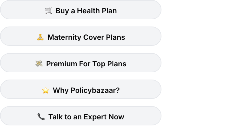
When the agent isn't sure what the visitor wants, offer the likely answers as buttons.
 Blocks:
```text theme={null}
row
button "Yes" Send to agent value=yes width 33
button "No" Send to agent value=no width 33
button "Call me back" Send to agent value=callback width 34
```
Wiring: No API needed: each tap sends its **Value** to the agent. The **Quick actions** template is a starting point; it uses a separate Action ID per button instead of values.
## Answer a question with a structured card
When the answer has caveats, lead with the verdict, keep the detail one tap away, and end with the next step.
Blocks:
```text theme={null}
row
button "Yes" Send to agent value=yes width 33
button "No" Send to agent value=no width 33
button "Call me back" Send to agent value=callback width 34
```
Wiring: No API needed: each tap sends its **Value** to the agent. The **Quick actions** template is a starting point; it uses a separate Action ID per button instead of values.
## Answer a question with a structured card
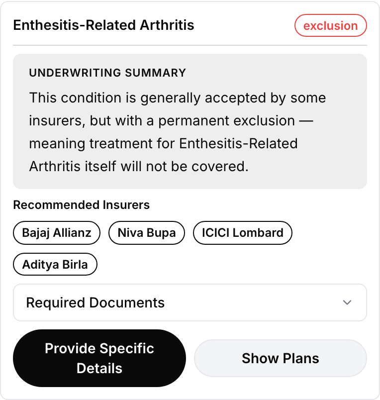
When the answer has caveats, lead with the verdict, keep the detail one tap away, and end with the next step.
 Blocks:
```text theme={null}
card
row
header ${{condition_name}}
badge ${{verdict}} tone=danger
callout ${{summary}} title="Underwriting summary"
text "Recommended insurers"
row repeat over ${{api_res.insurers}} as insurer
badge ${{insurer.name}}
expander "Required documents"
text ${{api_res.documents}}
row
button "Provide specific details" Send to agent width 50
button "Show plans" Send to agent width 50
```
Wiring: `condition_name` and `verdict` are dynamic parameters the agent fills from the conversation, while the supporting detail comes from the fetch. Give the two buttons different Action IDs so the agent knows which way the visitor went.
Finish the flow with a plain confirmation once the visitor commits:
Blocks:
```text theme={null}
card
row
header ${{condition_name}}
badge ${{verdict}} tone=danger
callout ${{summary}} title="Underwriting summary"
text "Recommended insurers"
row repeat over ${{api_res.insurers}} as insurer
badge ${{insurer.name}}
expander "Required documents"
text ${{api_res.documents}}
row
button "Provide specific details" Send to agent width 50
button "Show plans" Send to agent width 50
```
Wiring: `condition_name` and `verdict` are dynamic parameters the agent fills from the conversation, while the supporting detail comes from the fetch. Give the two buttons different Action IDs so the agent knows which way the visitor went.
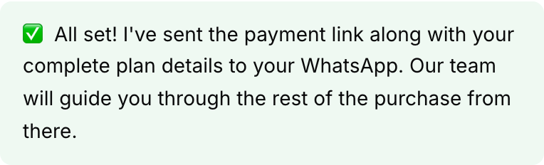
Finish the flow with a plain confirmation once the visitor commits:
 ## Drive your own page from the chat
Sometimes the outcome is something happening on the page: open the checkout drawer, scroll to a section, prefill a field.
Blocks:
```text theme={null}
button "See pricing" Page event event_id=ringg:open_pricing
```
On your page, listen for `ringg:open_pricing` as in [Fire an event on your page](/documentation/deploy/web-and-apps/web-widget/data#fire-an-event-on-your-page).
If the visitor never needs to tap anything, an [agent action](/documentation/deploy/web-and-apps/web-widget/data#agent-actions) lets the agent dispatch the event itself.
## Collect a list, one entry at a time
Long repeating forms are hard to fill in a chat. Collect one entry, confirm it, then offer another.
## Drive your own page from the chat
Sometimes the outcome is something happening on the page: open the checkout drawer, scroll to a section, prefill a field.
Blocks:
```text theme={null}
button "See pricing" Page event event_id=ringg:open_pricing
```
On your page, listen for `ringg:open_pricing` as in [Fire an event on your page](/documentation/deploy/web-and-apps/web-widget/data#fire-an-event-on-your-page).
If the visitor never needs to tap anything, an [agent action](/documentation/deploy/web-and-apps/web-widget/data#agent-actions) lets the agent dispatch the event itself.
## Collect a list, one entry at a time
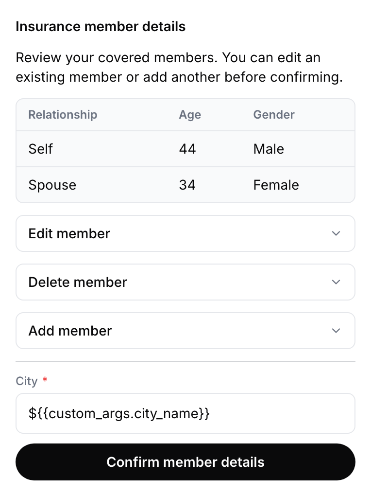
Long repeating forms are hard to fill in a chat. Collect one entry, confirm it, then offer another.
 Blocks:
```text theme={null}
card
header "Add a family member"
text "Enter details for one family member at a time."
form
input_text name=full_name label="Full name" required
input_number name=age label="Age" required
input_text name=city label="Current city" width 50
input_single_select name=relationship label="Relationship to you" required
button "Submit family member" Send to agent action_id=submit_family_member
button "Add another member" Send to agent action_id=add_another
```
Wiring: Let the prompt drive the loop rather than the component:
```text theme={null}
When the visitor agrees to add dependants, show @[[family_member_details_form]]
and collect one member at a time. After each submission, confirm the details
back to them and ask whether they want to add another.
```
The agent sends a fresh form for each member, which keeps validation per entry and gives the visitor a natural place to stop.
## Next steps
Restyle any block or widget element with `data-ringg` attributes.
Domains, CSP, version pinning and browser QA.
This documentation is built and hosted on [Mintlify](https://mintlify.com), a developer documentation platform.
Blocks:
```text theme={null}
card
header "Add a family member"
text "Enter details for one family member at a time."
form
input_text name=full_name label="Full name" required
input_number name=age label="Age" required
input_text name=city label="Current city" width 50
input_single_select name=relationship label="Relationship to you" required
button "Submit family member" Send to agent action_id=submit_family_member
button "Add another member" Send to agent action_id=add_another
```
Wiring: Let the prompt drive the loop rather than the component:
```text theme={null}
When the visitor agrees to add dependants, show @[[family_member_details_form]]
and collect one member at a time. After each submission, confirm the details
back to them and ask whether they want to add another.
```
The agent sends a fresh form for each member, which keeps validation per entry and gives the visitor a natural place to stop.
## Next steps
Restyle any block or widget element with `data-ringg` attributes.
Domains, CSP, version pinning and browser QA.
This documentation is built and hosted on [Mintlify](https://mintlify.com), a developer documentation platform.